
Leer este reportaje en español
LINK COMUNICA / REVISTA · WEB DESIGN · UX · DIGITAL EXPERIENCE
Updated: November 16, 2026
In 2026, the best website is not the one with the most effects: it combines authentic imagery, editorial design, accessibility, adaptive components and measurable performance. A practical look at what deserves to ship.
The end of the website as a static poster
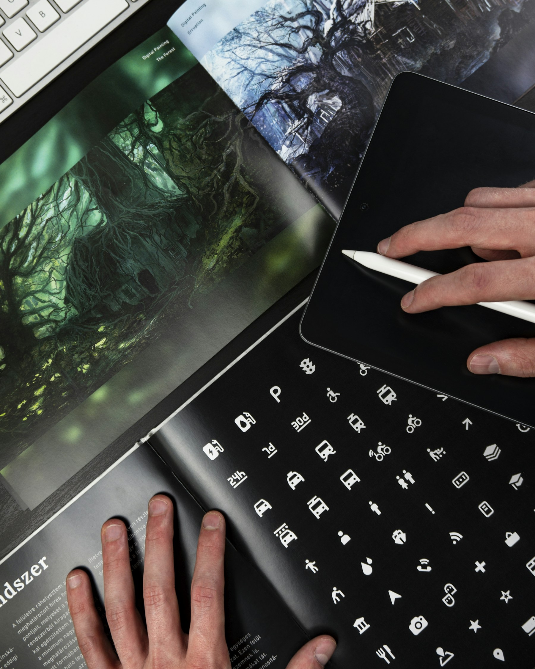
Web design in November 2026 resembles an editorial and service system more than a digital shop window: it responds to context, reacts to interaction and maintains a coherent identity across screens. Quality is no longer determined by a striking homepage effect but by the relationship among content, navigation, performance and trust.
Modern browsers can now handle experiences that once required large JavaScript libraries. View transitions, adaptable components, fluid typography and certain scroll-linked animations use native capabilities, as long as alternatives remain available where support is incomplete.
The most important shift is one of judgment: an extraordinary website is not necessarily the one with the most motion, but the one that helps people understand, navigate and act with minimal friction.
Editorial typography: identity before spectacle
Typography has moved back to the center. Large headlines, variable fonts, considered reading rhythms and well-designed contrast create personality without overwhelming the interface. Magazines, portfolios and cultural platforms often benefit from pairing an expressive headline face with a highly readable family for navigation and body text.
Type should respond to available space. CSS clamp() supports fluid scales, but it still needs reasonable line heights and paragraph widths. A giant headline that breaks a card or an oversized attribution that overlaps a sidebar is not an editorial statement: it is a layout bug.
For teams publishing through WordPress, the practical task is defining reusable block styles and testing real content: long headlines, multiple languages, long words, quotations, captions and portrait photography.
Bento grids: useful only when hierarchy exists
Modular layouts built from cards of different sizes, often called bento grids, can display varied material on one surface. They work when visual priorities are clear and each module has enough substance to justify its size.
Indiscriminate use creates a false sense of modernity. If everything is prominent, nothing is prominent. Cards need a consistent system of proportions, imagery, headings and spacing, as well as a logical order on small screens.
A good digital magazine needs a lead story, secondary selection and thematic paths. The grid should express that editorial judgment, not replace it.

Native motion, yes; gratuitous animation, no
The View Transitions API enables browser-supported transitions between interface states. CSS scroll-driven animations can connect certain visual effects to reading position. Both are promising for portfolios, narrative visualization and progressive web apps.
Yet support for cross-document transitions and some scroll-driven mechanisms is not universal. The right approach is progressive enhancement: build a fully functional experience first and add decorative transitions when supported.
Accessibility also sets limits: respect prefers-reduced-motion, avoid motion that interferes with reading and provide controls for automatically rotating carousels and video.
Authentic photography and consistent framing
Imagery is one of the most visible design decisions. Many websites have relied on generic stock photography that could belong to any organization. In 2026, showing real people, places, projects and processes creates stronger editorial identity.
A design system should distinguish two uses: controlled thumbnail crops and photographs inside stories. On a horizontal card, object-fit:cover may be useful when the focal point is adjusted; for a full-length portrait, an automatic crop can remove a face or outfit. In that case, preserving the full image is the better editorial decision.
Images need responsive sizes, alternative text, credits, appropriate lazy loading and efficient formats such as WebP or AVIF, without allowing visual sophistication to block reading.
Core Web Vitals: speed is part of the design
Performance is not a finishing task. Entrance animation can make a page feel slower; a third-party script can delay interaction; a hero image without dimensions can shift the page as it loads.
Google uses Interaction to Next Paint (INP) to measure responsiveness. Alongside LCP and CLS, it helps evaluate real user experience, though no single metric replaces usability testing.
Teams should test on mid-range mobile devices, reduce unnecessary dependencies, optimize images, reserve space for media and verify the effects of new plugins or features.

Accessibility is not an optional module
WCAG 2.2 offers a foundation for keyboard access, sufficient contrast, visible focus and understandable components. Legal obligations vary by location and service type, but accessibility should be integrated from the earliest design stages.
A beautiful menu that works only on hover, unlabeled buttons or white text over overly bright images can make a page unusable. Automated checks find some issues, but real keyboard navigation, screen-reader testing and zoomed text remain essential.
Accessibility also increases resilience. Clear interfaces work better with poor connections, fatigue, difficult lighting and smaller screens.
AI in the design workflow, not in charge of the brand
AI assistants can help explore structures, draft copy, generate component variations and automate checks. They can also produce attractive pages that repeat generic patterns or hide accessibility, security and performance defects.
The team still needs to decide information architecture, editorial voice, visual design and content. Photography of real people and projects should be authentic when presented as documentation; generated images should be disclosed if they might mislead.
AI adds the most value when it speeds iteration and frees time for research, testing and strategy—not when it removes accountability from publishing.
WordPress, PWAs and maintainable components
A professional platform can combine WordPress as an editorial CMS, reusable components and progressive web app features without turning every page into a one-off experiment. The crucial principle is separating content, design and behavior.
Featured cards, hero imagery, headers, bilingual navigation and article blocks should follow common patterns. When a module changes, the team should be able to verify improvements across the entire site rather than rebuild every page manually.
A PWA can provide installation and, where implemented properly, certain offline or notification capabilities. It does not replace a fast mobile experience or justify requesting permissions before explaining their value.
Design that lasts beyond the trend cycle
Visual trends change. A recognizable editorial structure, inclusive experience, meaningful content and technology that does not distract from the purpose are far more durable.
The best interfaces at the end of 2026 use motion to explain, typography to establish hierarchy, photography to document and AI to support accountable human teams.
The future of web design is not about adding layers of effects; it is about removing obstacles between people and what they came to find.
Sources and further reading
- MDN — View Transitions API — documentación técnica
- MDN — CSS Container Queries — documentación de interfaces adaptables
- MDN — Scroll-driven animations — compatibilidad progresiva
- web.dev — Interaction to Next Paint — métrica de respuesta a la interacción
- W3C — WCAG 2.2 — recomendación de accesibilidad
- Google Chrome — Modern Web Guidance — buenas prácticas de animación
- We.Inc — Web Design Trends 2026 — actualizado el 27 de octubre de 2026
Research and editorial production: Link Comunica. Illustrative photographs sourced via Unsplash. This feature distinguishes documented facts, vendor announcements and editorial analysis.